Mapping storms in R
Japan is currently counting the cost of the strongest typhoon to hit its coasts in 25 years. The death toll currently stands at nine, and hundreds were injured.
The north western Pacific basin sees many storms, and meteorology agencies release loads of data about climate events such as these. For this example, we are going to use the work of the National Oceanic and Atmospheric Administration, which releases datasets known as International Best Track Archive for Climate Stewardship.
Head to “data access” and make your way to the CSV release for each oceanic basin. We need the western Pacific one.
This blog was contributed to R Bloggers
Preparing data and basic mapping
Now let’s load our packages. No need for rgdal, we’ll do everything in ggplot.
library(ggplot2)
library(dplyr)
We read our data source in and just clean things up a bit.
# data source
basin <- read.csv('Basin.WP.ibtracs_all.v03r10.csv',
                  skip = 1, stringsAsFactors = FALSE)
basin <- basin[-1, ] # first column is garbled, disegard

# cleaner columns
basin$Season <- as.numeric(basin$Season)
basin$Latitude <- as.numeric(gsub("^ ", "", basin$Latitude))
basin$Longitude <- as.numeric(gsub("^ ", "", basin$Longitude))
basin$Wind.WMO. <- as.numeric(gsub("^ ", "", basin$Wind.WMO.))
basin$Name <- as.factor(basin$Name)
For the purpose of this exercise, we want to visualise 2000 to 2017 data. Sadly our dataset does not contain data for 2018 yet… Please excuse my poor chaining of filter() methods – I am but a journalist after all.
# extract 2000 to 2017 data
# also remove some weird datapoints
substorms <- basin %>%
  filter(Season %in% 2000:2017) %>%
  filter(!Name == "NOT NAMED") %>%
  filter(!Latitude == -999) %>%
  filter(!Longitude == -999)

substorms$ID <- as.factor(paste(substorms$Name, substorms$Season,
                                sep <- "."))
We’re going to rely on map_data("world") for our base map. In ggplot world that’s how we build that up:
# world map
ggplot() +
  geom_polygon(data = map_data("world"),
  aes(x = long, y = lat, group = group))

Our storms will be a set of geom_path() which lat/long coordinates we’ve passed in at the top.
The object of our study here is a series of tracks followed by each storm. Representing tracks as lines feels natural. As our data comes as a list of points, we need to group together all the points that represent one storm. Were we studying say, the winds, we would run something like this, grouping our points by storm unique ID.
substorms %>%
  group_by(ID) %>%
  summarise(average_winds = mean(Wind.WMO.)) %>%
  arrange(desc(average_winds))

A tibble: 401 x 2
   ID               average_winds
   <fct>                    <dbl>
 1 JELAWAT 2012 .            71.4
 2 HAIYAN 2013 .             70.5
 3 CHOI-WAN 2009 .           69.2
 4 FENGSHEN 2002 .           68.8
 5 MEGI 2010 .               68.7
We can do the same inside ggplot by passing aes(group = ID). Here is our result:
ggplot(substorms, aes(x = Longitude, y = Latitude, group = ID)) +
  geom_polygon(data = map_data("world"), aes(x = long, y = lat, group = group)) +
  geom_path(data = substorms, aes(group = ID))

Now let’s add some styles. We also need to limit our map coordinates to Asia and the Pacific, and voilà.
Edit December 2018: In order to prevent the odd clipping and horizontal lines from coord_map(), we need to clip the world map polygons ahead of rendering:
wm <- map_data("world")

library("PBSmapping")
data.table::setnames(wm, c("X","Y","PID","POS","region","subregion"))
worldmap <- clipPolys(wm, xlim=c(60,180),ylim=c(-20, 60), keepExtra=TRUE)
theme_opts<-list(theme(panel.grid.minor = element_blank(),
                       panel.grid.major = element_blank(),
                       panel.background = element_blank(),
                       plot.background = element_blank(),
                       axis.line = element_blank(),
                       axis.text.x = element_blank(),
                       axis.text.y = element_blank(),
                       axis.ticks = element_blank(),
                       axis.title.x = element_blank(),
                       axis.title.y = element_blank(),
                       plot.title = element_blank()))

ggplot(substorms, aes(x = Longitude, y = Latitude, group = ID)) +
  geom_polygon(data = worldmap, aes(x = X, y = Y, group = PID),
               fill = "whitesmoke", colour = "gray10", size = 0.2) +
  geom_path(data = substorms, aes(group = ID),
            alpha = substorms$Wind.WMO./500, size = 0.8,
            color = "red") +
  coord_map(xlim = c(60,180), ylim = c(-20, 60)) +
  labs(x = "", y = "", colour = "Wind \n(knots)") + theme_opts

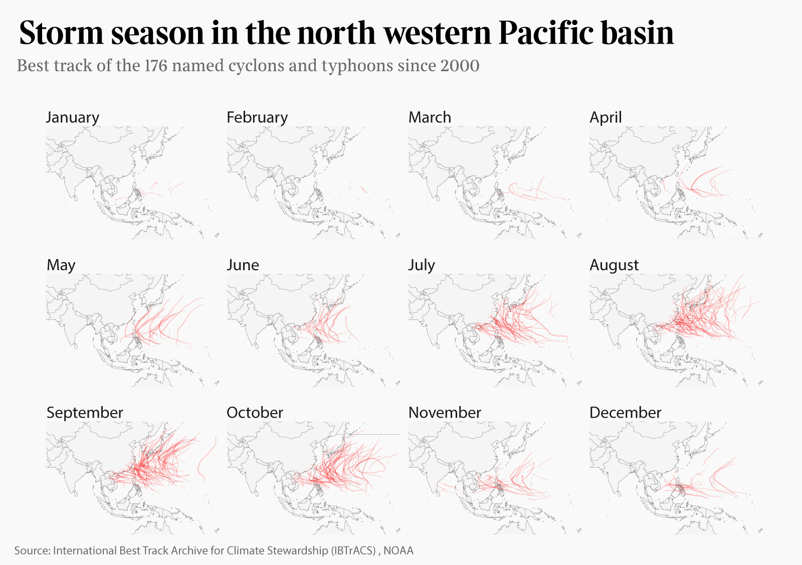
Storms by year and month
Now who doesn’t like a good facetting? That’s how I fell in love with ggplot in the first place. We can easily extract dates from our data in order to prepare for different facetting opportunities.
Facetting by year allows us to visually (and relatively unreliably) compare years against each other. Doing the same operation by month will show when do typhoons mostly hit in the Pacific. (Edit December 2018: we now use lubridate functions to do so.)
# extract month and year for facetting later
library(lubridate)
substorms <- substorms %>%
  mutate(Month = month(as.Date(ISO_time))) %>%
  mutate(Year = year(as.Date(ISO_time)))
+ facet_wrap(~Year)

And finally, by month (with the types done up in Illustrator):
+ facet_wrap(~Month)
